BY C.M. MAYO — February 14, 2022
UPDATE: This blog was then entitled Madam Mayo (2006-2022).
This post was originally published on February 4, 2016.
This blog posts on Mondays.
Second Mondays of the month I devote to my writing workshop students and anyone else interested in creative writing. Welcome!
> For the archive of workshop posts click here.
While it may have become far easier to self-publish, and most self-published books look a sight slicker than they did in days of yore, alas, they still more often than not look (ahem) self-published. So for my dear amiga who recently asked me— and for you, dear writerly reader—here are my top tips for making your self-published book look professionally designed, which is to say, reader-friendly.
1.
For your text choose an easy-on-the-eye font.
Do not get lost “shopping around” in that gnarly list of fonts already installed in your computer!
The best way to grok this issue is to get up from your computer and walk over to your own bookshelves. Pull down some 3 – 7 books that you have already read and loved. My bet is, these books are well-designed or else you wouldn’t have managed to finish reading them.
So look at those fonts. Emulate those fonts! And in he unlikely event that any of them do happen to be hard on your eyes, why, pray tell, subject your readers to them?
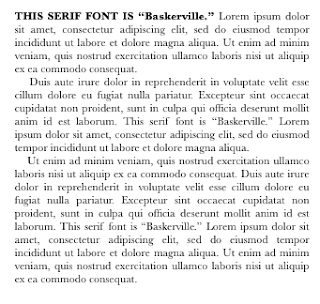
In case you were wondering, this blog uses Merriweather, an easy-on-the-eye font for print text.
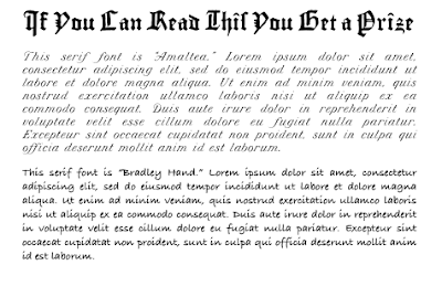
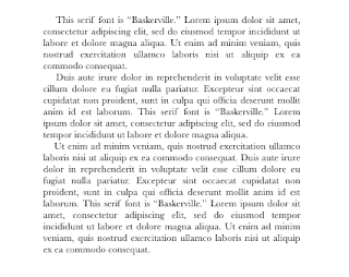
The image below shows the sort of fonts to avoid like the devil because— I’m sure we can agree— they’re a pain to read:
2.
Consider pairing a sans-serif font for chapter titles
(and possibly also subtitles) with a serif font for the text.
What’s serif? It’s a typeface with itty bitty thingamajigs on the letters.
What’s sans-serif? It’s a typeface without those itty bitties.
Pick one of each, et voilà.
This isn’t a must, but it often works nicely. Here are some examples of sans-serif and serif font pairings that might work for you:
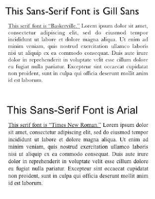
A few sans-serif fonts I like:
Arial, Gill Sans, Helvetica, Verdana
A few serif fonts I like:
Baskerville, Garamond, Georgia, Sabon, Times Roman
3.
Be a Midas with the margins!
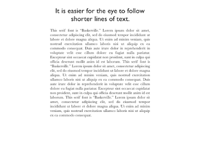
More often than not the first thing that screams “self-published” and “amateur” is a page with text splatulaed into every corner. Why such Scroogerie with blank paper is so common mystifies me because everybody knows from their own experience that it is, indeed, ex-haust-ing for the eye to follow long lines of crowded text. Badly designed books usually end up, sooner or later, in a dump— now there’s a waste of paper.
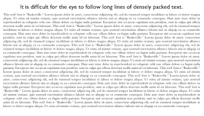
Compare:
4.
Break up the text, where appropriate.
Another thing that makes it easier on the reader’s eyes: Where appropriate (I know, sometimes it’s not), break up big chunks of text into smaller paragraphs and/or sections. For example:
5.
For chapter and/or section openings,
consider using a drop cap
and/or some variation to the text such as caps
and/or bold and/or italics
and/or even another font.
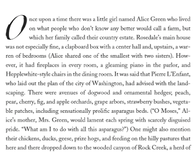
Yet another trick to make it easier on the reader’s eyes is the drop cap, which is just an unusually large capital letter to kick off the text. This first example shows a bold drop cap (from the opening chapter of my latest book):

This next image is the opening chapter of my novel, The Last Prince of the Mexican Empire. This design was done by publisher, Unbridled Books. My point is: you can really get wiggy with those drop caps!
Here is an example without a drop cap but with the opening text in capitals and bold:
Again, look through the books on your bookshelf that you have already read and loved and see if you can identify some of these elements— and more.
*
A Note on Adobe InDesign
If you plan to print a paperback book, as opposed to something you run off at Office Depot or your local copy shop, you will need to get your design into Adobe InDesign, and from there, make a PDF. Adobe InDesign has a frighteningly steep learning curve— and picture at the top of the cliff some ogres readying to roll down a boulder or three. I venture that unless you’re a software whiz or are planning to make a profession of graphic design, the few hundred dollars to hire a professional to format your book would probably be money well spent.
There are oodles more notions about book design and a hundred and seventeen ways to get started on that monster of a subject. My number one recommendation is to take Edward Tufte’s one day workshop if you possibly can.
Apart from all of the above, I have little more to say on this subject because I am not an expert on designing books; what I do is write them, and read even more of them.
P.S. See also the excellent post on formatting a book interior by Holly Brady.
*
I welcome your courteous comments which, should you feel so moved, you can email to me here.

More on Seeing as an Artist or,
The Rich Mine of Stories About Those Who “See” the Emperor’s Clothes
Q & A with Katherine Dunn on White Dog and
Writing in the Digital Revolution
A Review of Claudio Saunt’s West of the Revolution:
An Uncommon History of 1776